How accessible design strengthened crisis
communication at Twin Pines
Twin Pines Behavioral Health was created as a self-initiated
project to demonstrate how calm visual design and clear
information architecture can reduce cognitive load for patients
in distress. The redesign focuses on accessibility,
emotional safety, and predictable navigation to help
patients find support quickly and confidently.
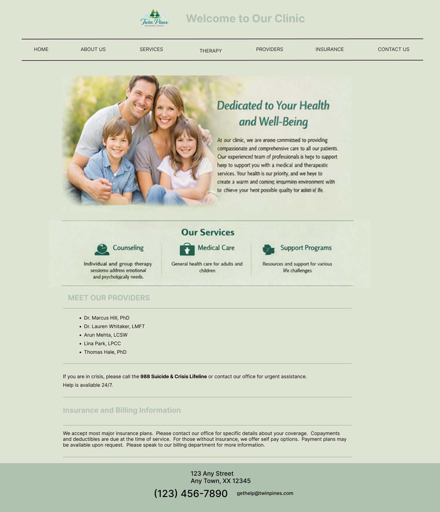
Accessibility Failures
- Low contrast between pale green text and background fails WCAG 2.2 AA guidelines.
- Navigation bar uses tiny links and no focus indicators
- There is no clear visual hierarchy, making it difficult for screen readers to identify structure.
- Crisis resources are buried mid-page in a paragraph instead of a distinct, high-contrast callout.
- Providers listed in plain text with no photo or alternative text.
Interface Issues
- No visible hierarchy or scannable structure.
- Crisis information is buried in a paragraph and not immediately visible
- No active-state indicators or hover feedback, so users are unsure where they are.
- Lacks a clear path to action. It’s unclear how to schedule, contact, or get help.
- Tone feels impersonal and administrative.
- Insurance information presented as a block of text with jargon.
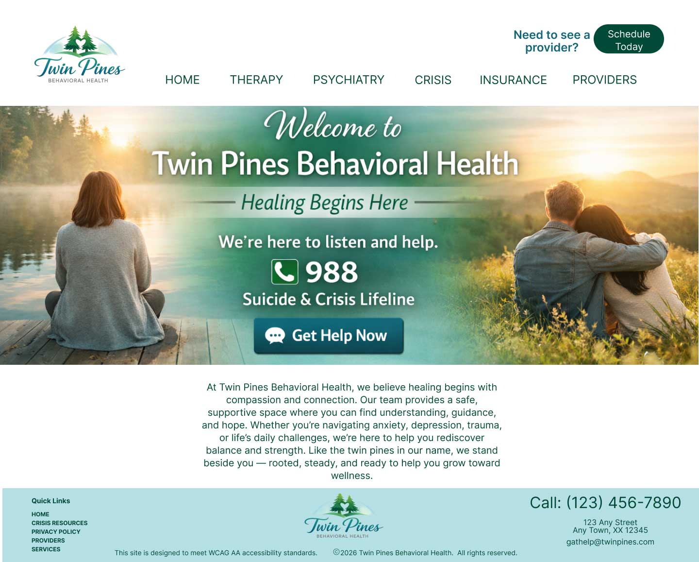
THE SOLUTION
The redesigned Twin Pines Behavioral Health website transforms a confusing, text-heavy experience into a calm,
accessible, and emotionally supportive digital environment. By restructuring content around user needs,
especially those seeking crisis help, the new design introduces clear hierarchy, high-contrast typography, and intuitive
pathways that reduce cognitive load and improve findability. Crisis resources are now immediately visible,
provider information is humanized and easy to navigate, and insurance details are simplified into scannable, user-friendly formats.
This solution prioritizes clarity, compassion, and WCAG 2.2 AA-aligned accessibility, so every visitor can quickly find the support they need.
Design Goals
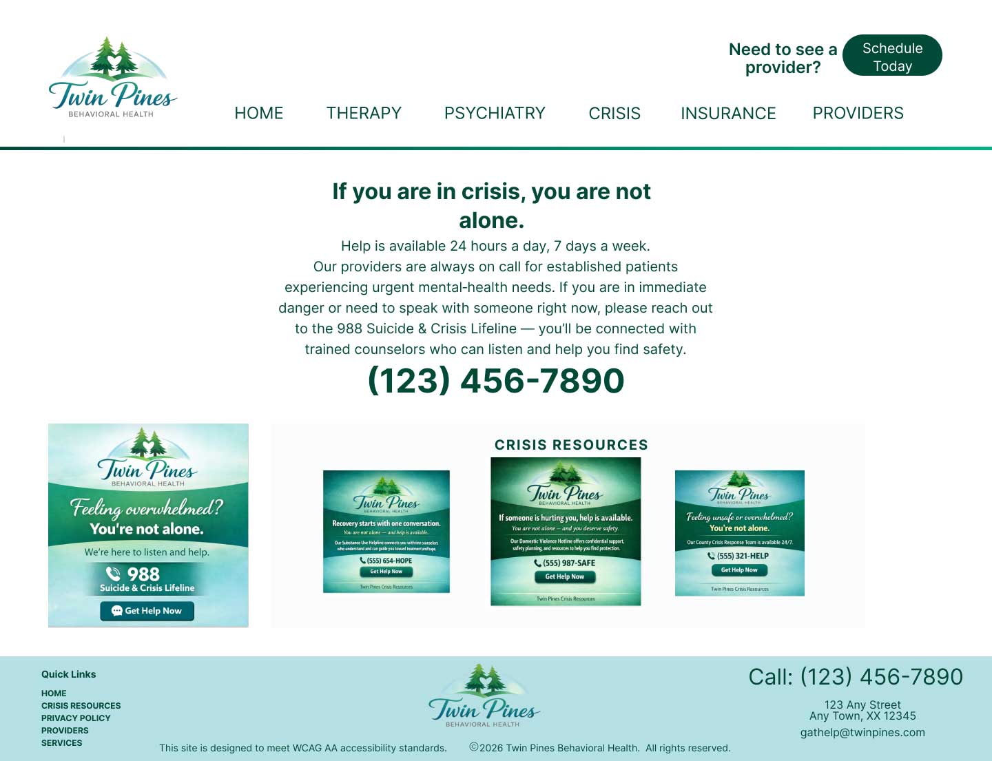
- Make crisis resources immediately visible and unmistakable to support patients in distress and reduce the time it takes to get help.
- Reduce cognitive load by restructuring dense paragraphs into scannable, patient‑friendly content.
- Create a clear visual hierarchy using accessible typography, spacing, and contrast.
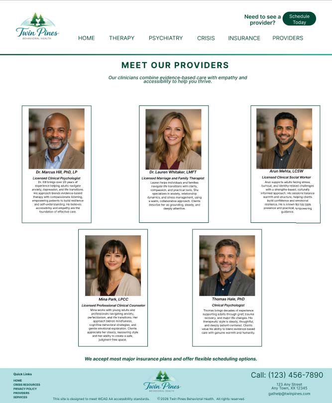
- Humanize provider information with photos, clear specialties, and intuitive navigation.
- Simplify insurance and billing content into digestible, action‑oriented sections.
- Achieve WCAG 2.2 AA‑aligned accessibility across contrast, structure, navigation, and readability.
- Establish an emotionally calm, supportive tone appropriate for behavioral‑health patients.
- Ensure mobile‑first responsiveness so all content remains usable across devices.
Outcome
- Crisis resources are now instantly visible, high‑contrast, and consistently placed across pages.
- Content is scannable and structured, reducing overwhelm and improving comprehension.
- Clear hierarchy guides users naturally from awareness to understanding to action.
- Provider bios are easy to browse, with photos, specialties, and accessible card layouts.
- Insurance information is simplified into short sections with clear next steps.
- Readability meets WCAG 2.2 AA standards, improving usability for low‑vision and neurodivergent users.
- Emotional tone is warm and supportive, replacing the generic, corporate feel of the original site.
- Mobile experience is fully responsive, eliminating horizontal scrolling and improving touch‑target usability.